
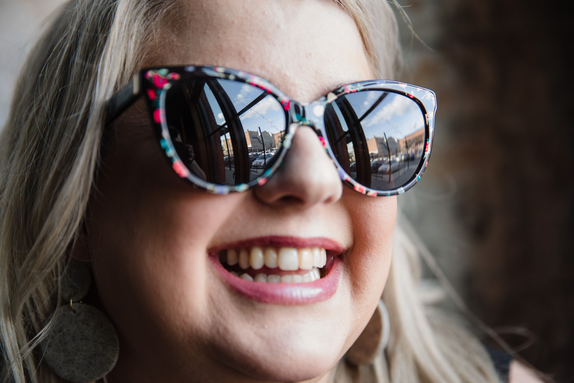
Photography That Builds Trust, Captures Connection, and Elevates Your Brand
Serving Spokane, Liberty Lake, Post Falls & Coeur d’Alene with Expert Personal Branding, Headshot, & Corporate Photography
You've done the work. Now it's time for photos that reflect your value.
With a WorkStory photoshoot, you get more than just great images—you get clarity, confidence, and visuals that actually work for your brand.
Whether you're building your personal brand, refreshing your team headshots, or stepping into a bigger role in your business, you’ll walk away with commercial photography that builds trust, elevates your credibility, and makes people say, “Yes—I want to work with them!”
No awkward posing. No guesswork. Just a smooth, guided experience that helps you show up looking like the expert you are—everywhere you need to be seen.
More than just photos
YOU NEED VISUALS THAT MAKE YOU LOOK CREDIBLE, AUTHENTIC & UNFORGETTABLE IN YOUR ADVERTISING
With Workstory you'll get...
Strategic guidance so you know what to create (and why)
A relaxed, professional experience—even if you hate being in front of the camera
Scroll-stopping, story-driven images that actually work for your brand
Whether you’re a coach or consultant ready to level up your personal brand, a business leader updating team headshots, or a corporation needing polished visuals for your new website—you're in the right place.
Our streamlined process removes the guesswork. You’ll feel confident, comfortable, and excited about how you show up online, in print, and in every first impression.
Hi, I'm your Spokane Branding Photographer, Tanya Goodall Smith
I was a graphic designer for years—creating brands, websites, and marketing materials for businesses all over the country. But I kept running into the same roadblock: the photos my clients sent me just weren’t cutting it. No matter how much guidance we gave, the images never truly captured who they were or what they offered.
That’s when I picked up a camera and decided to change the game. I started learning photography specifically to help businesses show up more powerfully and authentically online.
I was one of the first photographers in Spokane to offer what’s now called personal branding photography—before it even had a name. Helping people look legit, build trust, and confidently share their story with aligned visuals is still my favorite thing—and I’d love the chance to do that for you, too.
Signature Offers
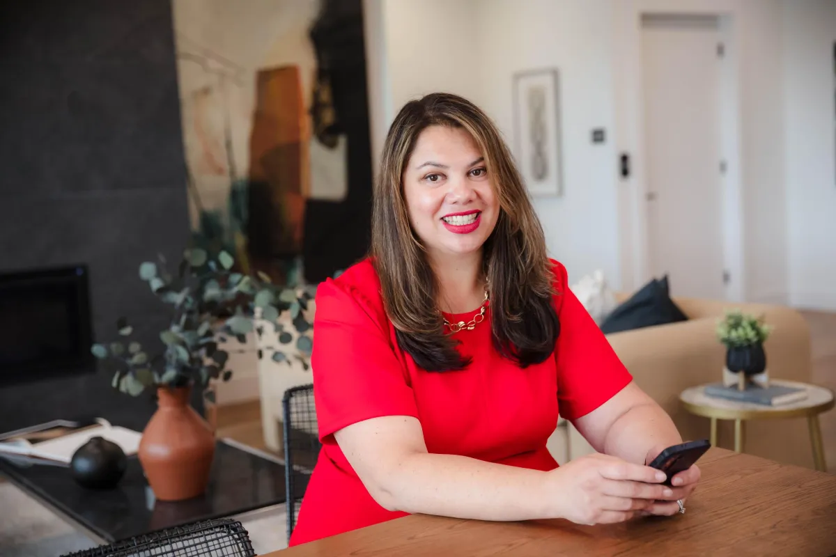
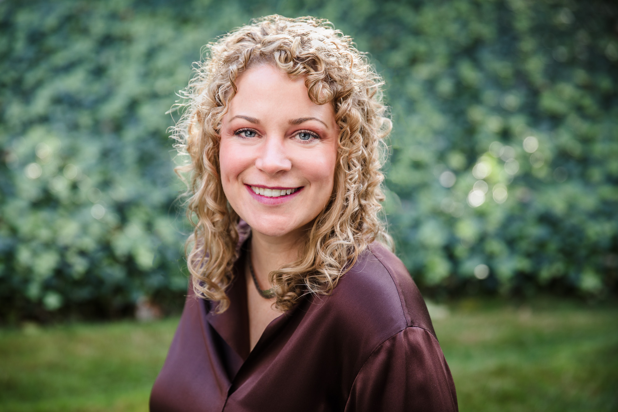
Branding Photography
Look like the expert you are with personal branding photography that reflects your personality and professional power.
Perfect for: Real estate agents, coaches, consultants, sales professionals, authors, course creators and service-based entrepreneurs ready to elevate their personal brand with a library of visual assets.
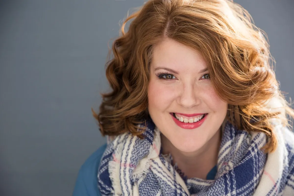
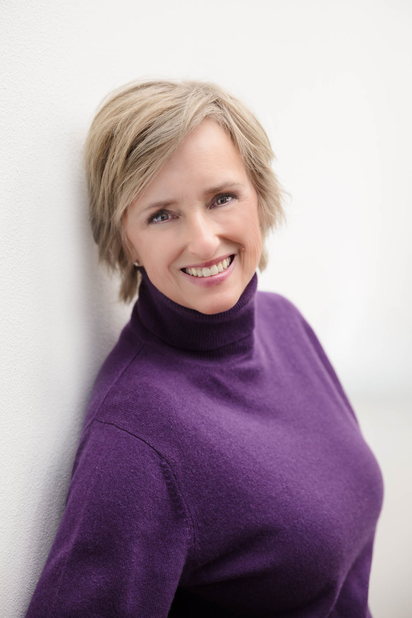
Professional Headshots
Individual and team headshots that help you show up online and in print polished and personable—because your face is your first impression.
Perfect for: Professionals updating their LinkedIn profile, website, email signature and business card, executives or authors preparing for media or speaking engagements, and teams who want a cohesive look.
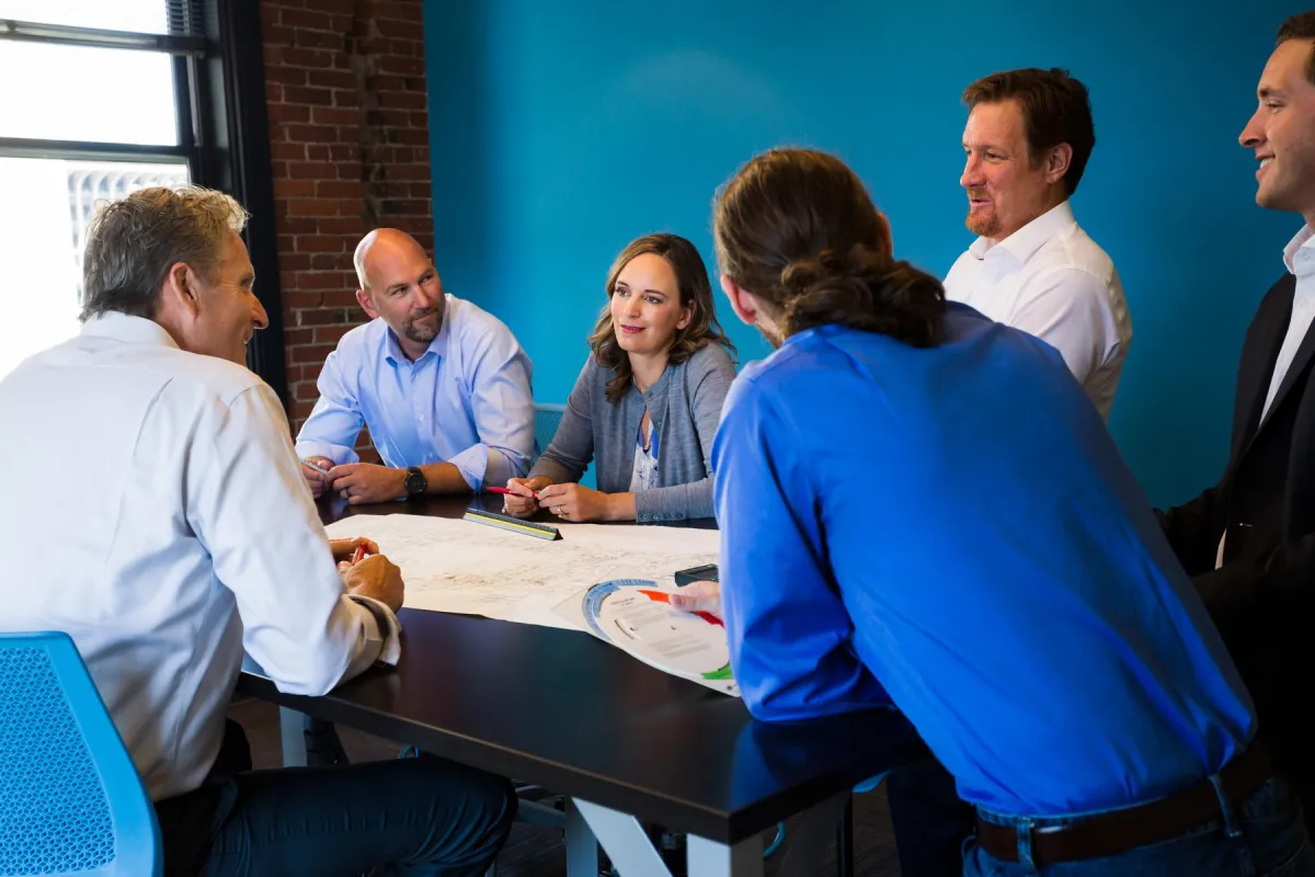
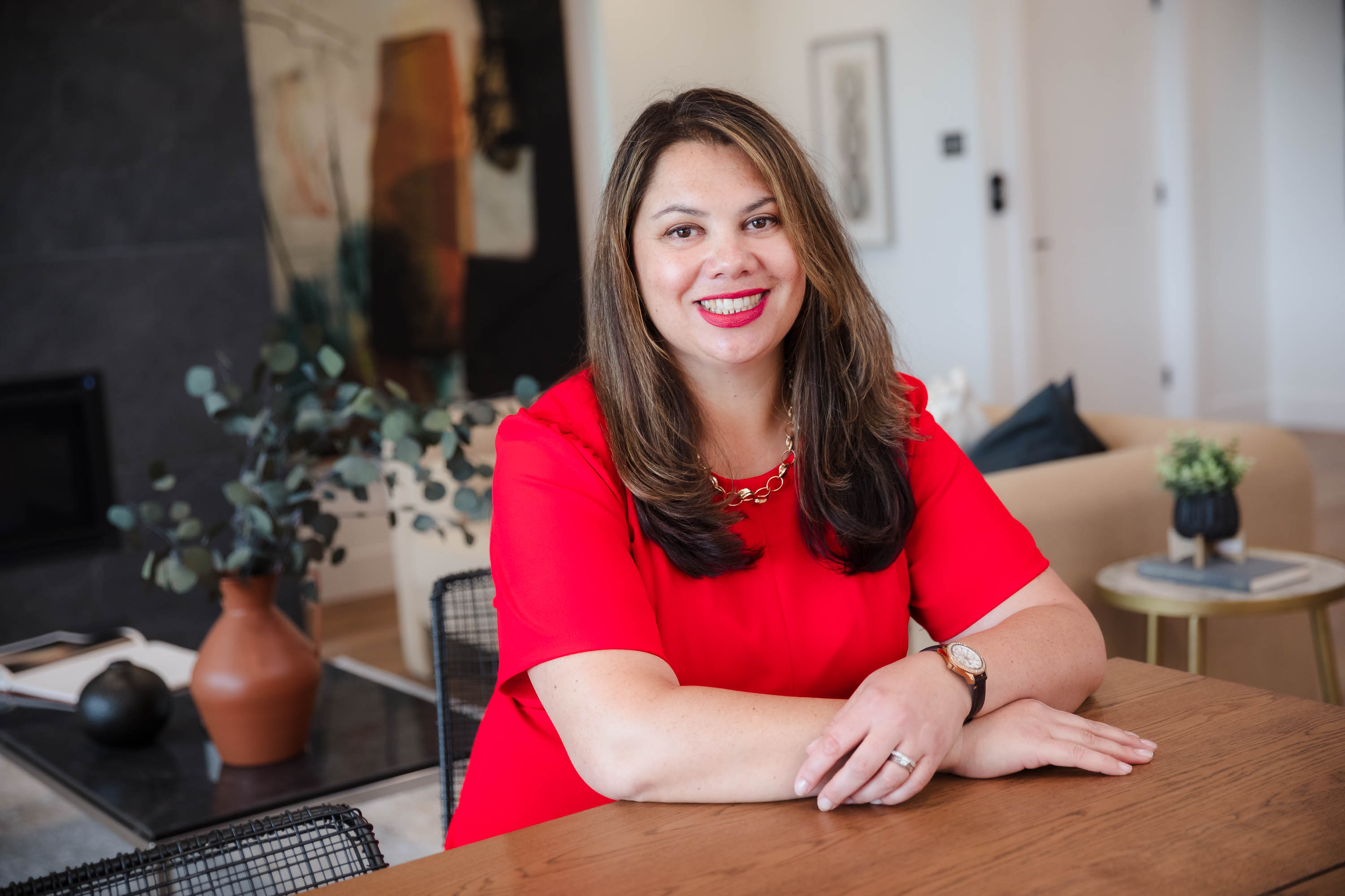
Corporate Photography
Cohesive, credible visuals of your team and space that elevate your brand across your website, social media, and marketing materials
Perfect for: Small businesses, medical and legal offices, accounting firms, nonprofits, and professional teams who want to present a polished, trustworthy image with a library of quality photo assets.
Ready to look like the pro you are?
Book your free consultation to find out how I can help you create commercial photography that opens doors and builds trust from the first glance.
Testimonials
kind words from a few amazing clients
Testimonials
Some kind words from amazing clients
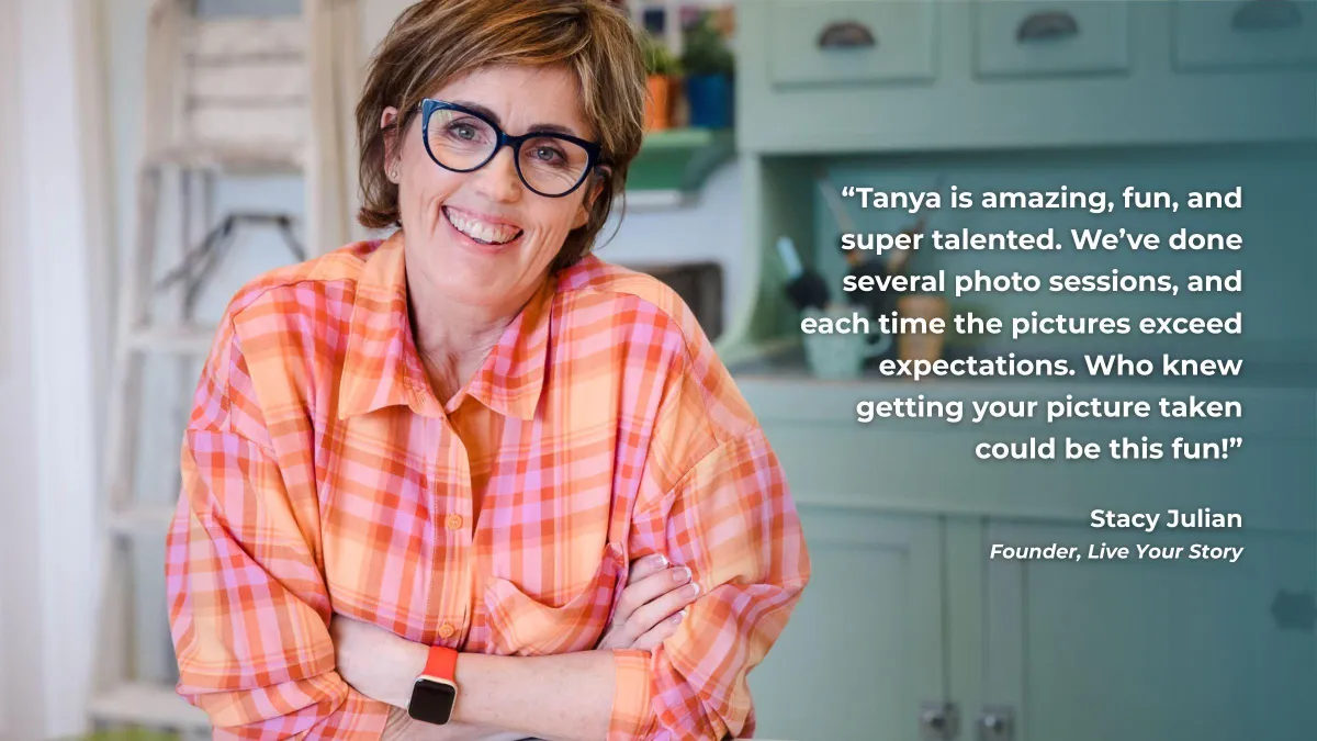
Tanya is amazing, fun, and super talented. We’ve done several photo sessions, and each time the pictures exceed expectations. Who knew getting your picture taken could be this fun!

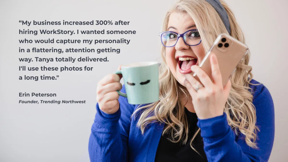
My business increased 300% after hiring WorkStory. I wanted someone who would capture my personality in a flattering, attention getting way. Tanya totally delivered. I'll use these photos for a long time.
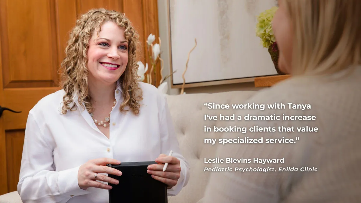
Since working with Tanya I've had a dramatic increase in booking clients that value my specialized service.
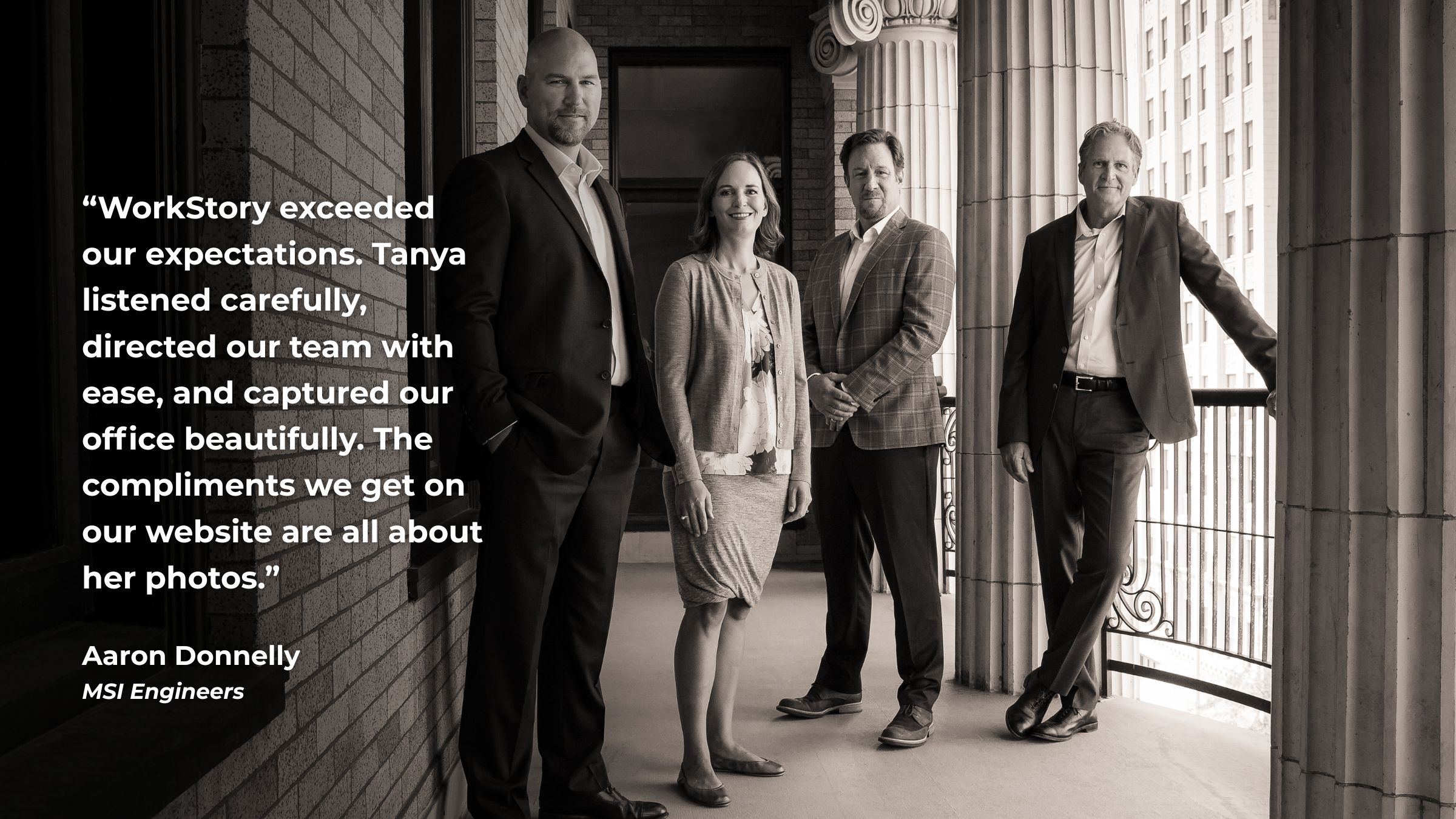
WorkStory came highly recommended, and Tanya delivered beyond expectations. She created and directed scenes with our team and office that resulted in beautiful, high-quality photos for our website and marketing.

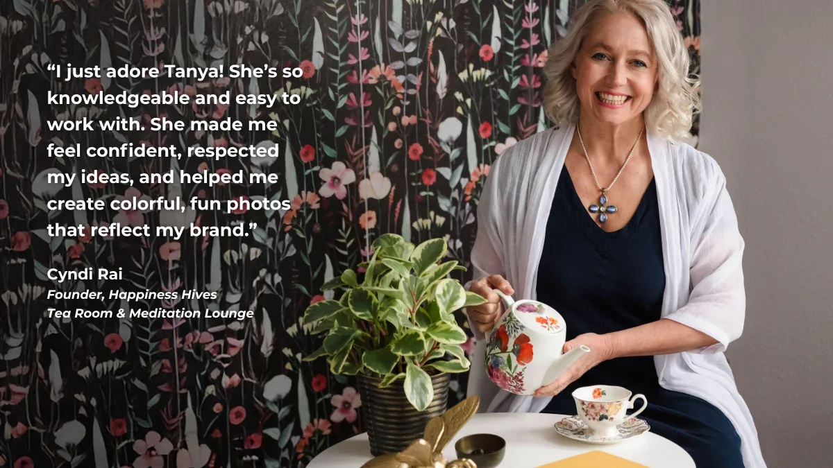
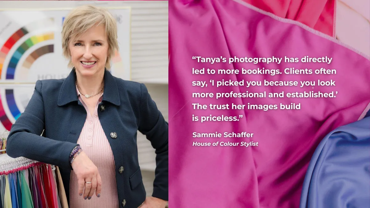
Tanya’s photography has directly led to more bookings. Clients often say, ‘I picked you because you look more professional and established.’ The trust her images build is priceless.
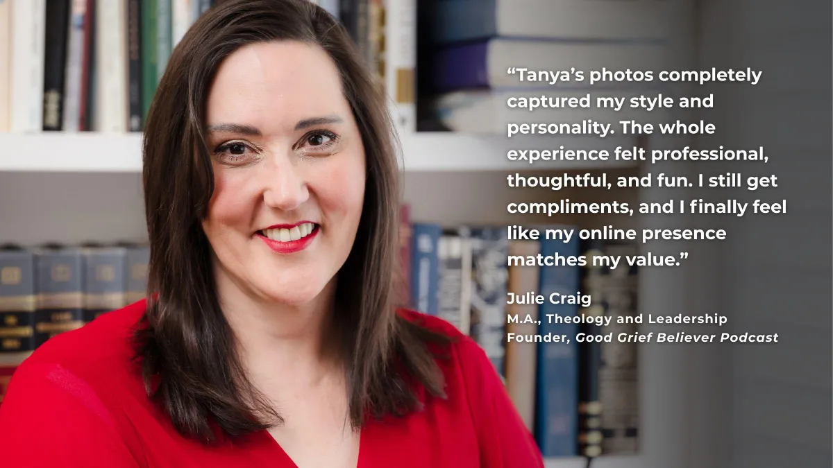
Tanya’s photos completely captured my style and personality. The whole experience felt professional, thoughtful, and fun. I still get compliments, and I finally feel like my online presence matches my value.

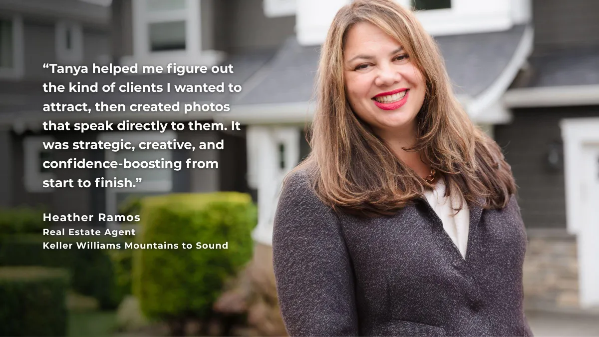
Tanya helped me figure out the kind of clients I wanted to attract, then created photos that speak directly to them. It was strategic, creative, and confidence-boosting from start to finish.
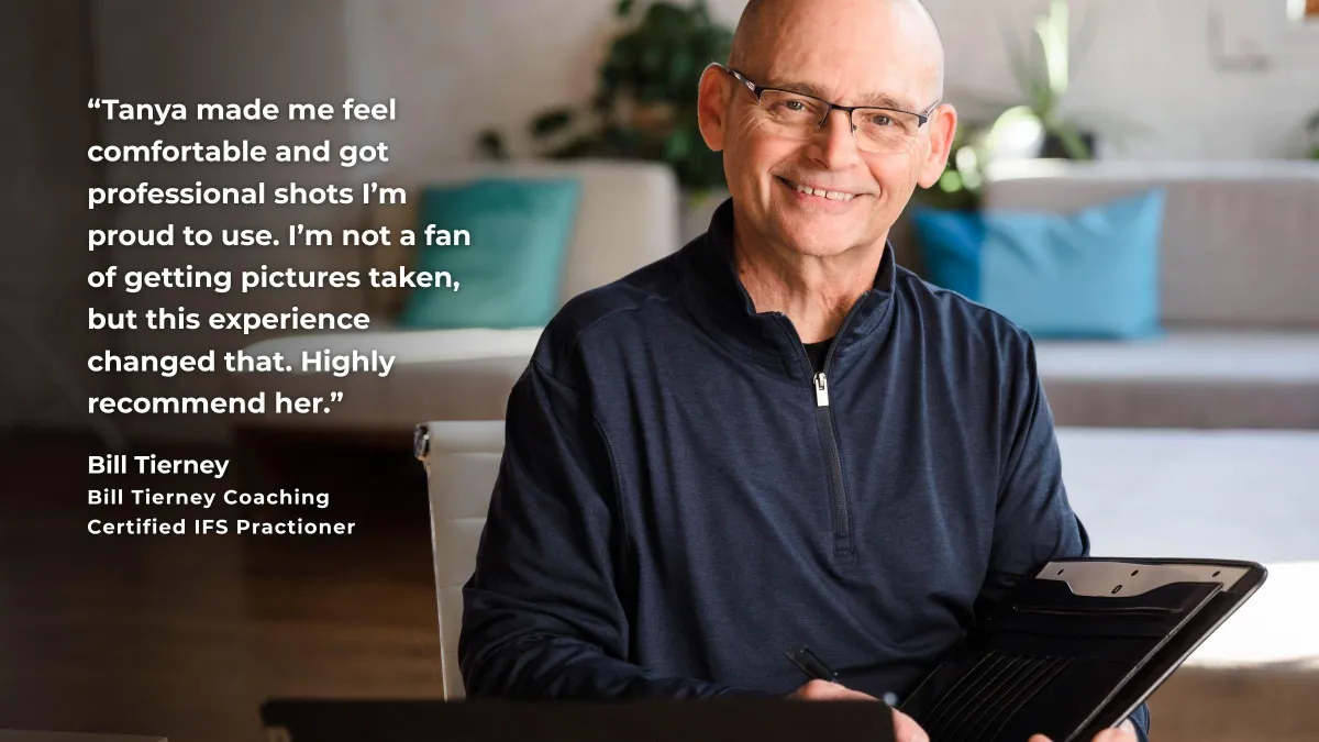
Tanya made me feel comfortable and got professional shots I’m proud to use. I’m not a fan of getting pictures taken, but this experience changed that. Highly recommend her.

Sign up to receive my monthly insider guide to showing up, standing out, and growing your business in the Inland Northwest.
Want to make a stronger first impression? The Inland Edit delivers curated tips, inspiration, and insider insights straight to your inbox—from what to wear for your next headshot to where Spokane-area business owners are actually showing up and getting seen. Join the email list and start showing up with confidence, credibility, and clarity—right here in the Inland Northwest.
Considering AI-Generated Images for your business? Read This First.
Why Real Photography Still Matters
In a world where AI can generate a headshot in seconds, people are craving what’s real more than ever before. Authentic photography builds trust in a way artificial images simply can’t. A real photoshoot captures you—your expressions, your energy, your environment—and creates images that connect with the people you’re here to serve.
Also, the process we take you through is part of the transformation. Clients often walk away from a WorkStory shoot feeling more confident, more aligned, and more clear about how they want to show up in their business. No filters, no fakery—just strategic, story-driven visuals that reflect your value and leave a lasting impression.
↓ MY GIFT TO YOU
Get This Amazing
Free Resource!

FREEBIE NAME HERE
The #1 lorem ipsum dolor sit amet.

100% risk free - 30 day money back guarantee
All the amazing things:
Amazing thing you get lorem ipsum
Great bonus you get lorem ipsum
Amazing thing you get lorem ipsum
Great bonus you get lorem ipsum
Usually $97
Yours FREE!

"Best purchase ever!"
"Testimonial lorem ipsum dolor sit amet, consectetur adipisicing elit." - Name
The Inland Edit
Your insider guide to showing up, standing out, and growing your business in the Inland Northwest.
Want to make a stronger first impression? The Inland Edit delivers curated tips, inspiration, and insider insights straight to your inbox—from what to wear for your next headshot to where Spokane-area business owners are actually showing up and getting seen. Join the email list and start showing up with confidence, credibility, and clarity—right here in the Inland Northwest.
View our Privacy Policy and Terms and Conditions here.
© 2025 WorkStory Creative, LLC. All Rights Reserved.